|
5/27/2021 0 Comments Logo DesignFor this summative that draws the year to an end, we were assigned to use all our knowledge about Gravit and how it works to make a logo without using any images to trace over, reference, etc. The creating process was quite easy, surprisingly. I just created three circles, the actual vinyl, the colored part and label, and lastly the holy in the middle of the vinyl. I then used the text feature and pen tool to further detail the label. As we were told to make three different variations of our logo, I decided to act as though all three were on a wall and made the vinyls all cool tones to go well with each other. The most difficult part about making this logo was the text and making it perfectly wrap around the record, even now it is still not perfectly aligned, but I tried my best. To help me with this challenge, I created circles and lines to make sure my text was evenly wrapped and lined up with each other. 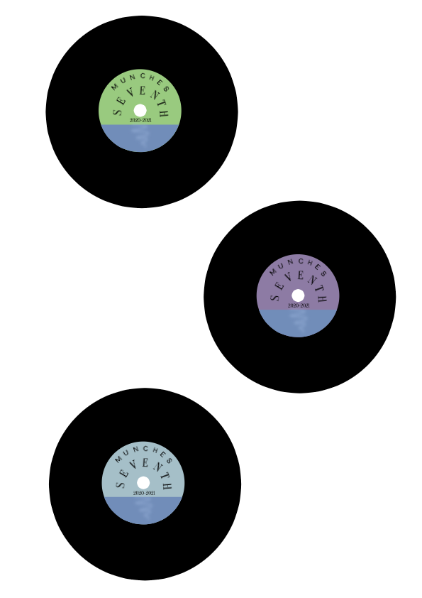 I decided to create a logo for myself. More specifically, I wanted to make an album for all the songs I listened to this year. I wanted this to have the same retro feel as old cassette tapes where when you play it, it instantly brings memories of better times from the past. I wanted to create a vinyl record because of several reasons. The most important one being that I love music. It has played such a huge role in my life so far and affects me heavily. My dad was also quite a collector of vinyls, all of which I believe we still have. I also just really love the way vinyls look and the feeling they give off. Out of all three of the variations for my logo, I liked the first matcha colored vinyl the most. Recently, the sage/matcha green has been a favorite color of mine for it's just so calming which is why I prefer that vinyl over the rest. 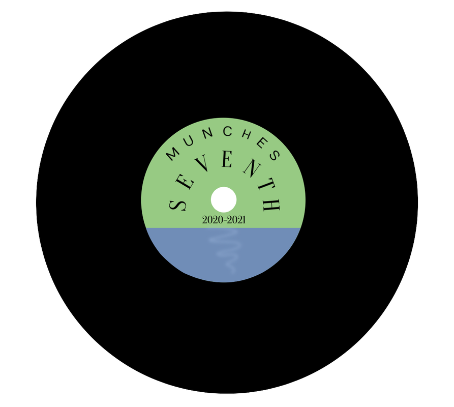
0 Comments
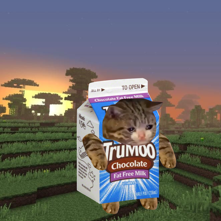
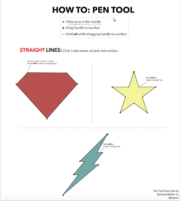
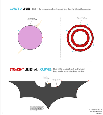
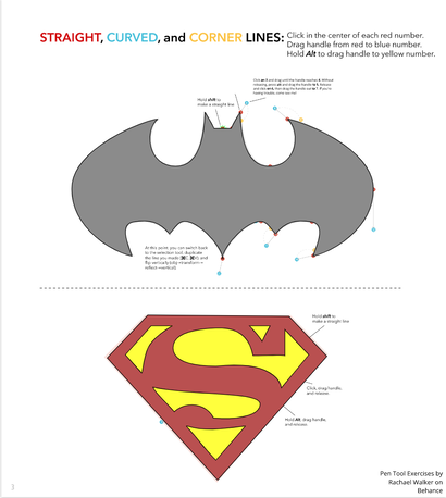
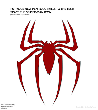
5/20/2021 0 Comments Color TheoryFor this summative, we were assigned to create two works: a color names project and a color schemes project. For the color names assignment we were told to make 15 different colors and just note down the hex codes and the RGB values. This was for us to get familiar with the hex codes and RGB values in general. For the second assignment (color schemes) we had to use the Adobe Color website to create color palettes that fit the requirements to be monochromatic, analogous, complementary, and triadic. For the color schemes project, I used a photo of the phases of the moon as a reference photo and used the pen tool to outline the image. To find a color palette that was for example triadic, I used Adobe Color and applied the "triad" color harmony rule. After that, I just dragged the circles around to find a tone I liked, and the triangle moved with me so it was very easy to make a triadic color palette. Color Names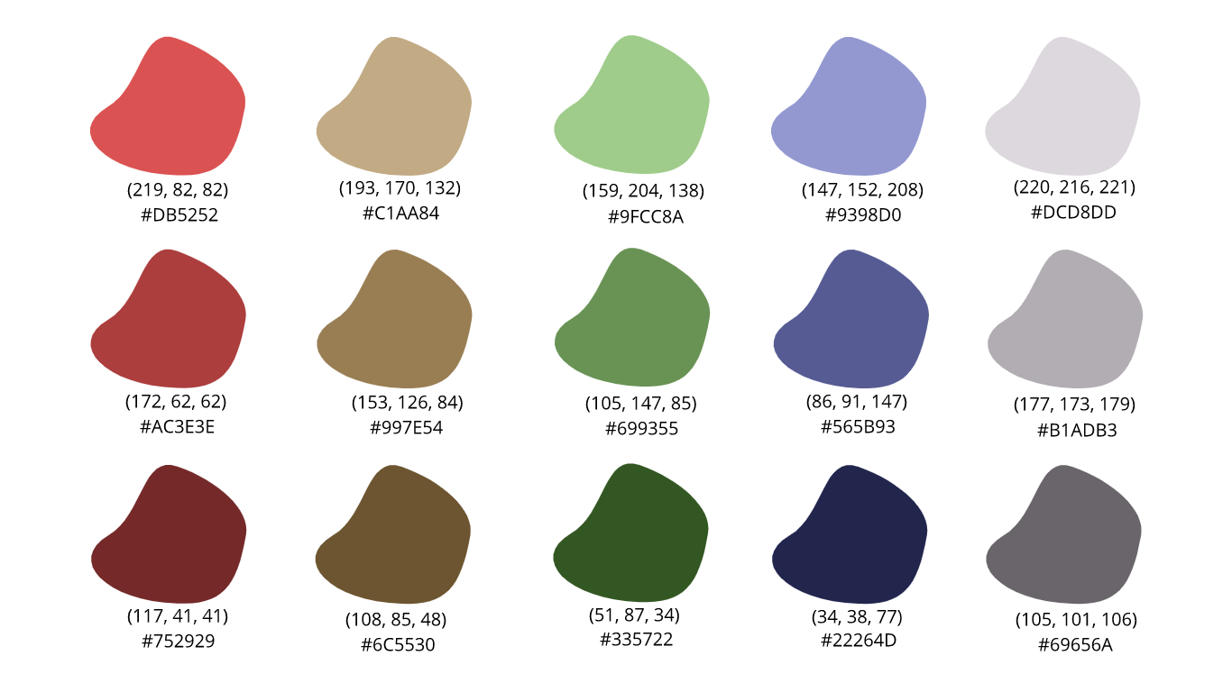 Color Schemes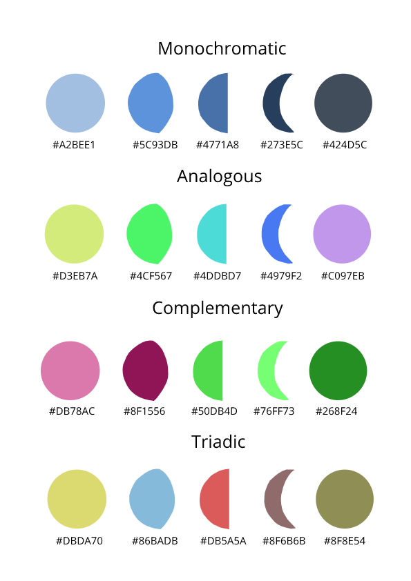 4/29/2021 0 Comments TypographyTypography is a style and appearance that is printed. Typography is important because it makes the text easy for the reader to look at, understand, and it also affects how the reader takes in the text. The quote "each font has a personality and a purpose" means that there is always a purpose for choosing a certain font because it fits the mood of the text better than others. Serif- has "legs" on the ends of the letters and is usually used in articles, newspapers, etc. Sans Serif- opposite of serif, smooth, also used in magazines, newspapers, etc. Monospaced- each letter takes up the same amount of space and is most commonly seen in computer programming and coding. Handwritten- appears to be written by hand and is often used in invitations, involving calligraphy. Display- a funky, eye-catching font that is usually only used as a title in posters or advertisements to catch people's eyes. Typeface ComparisonFor the typeface comparison, we were supposed to find one font for each of the following styles: a serif font, a sans serif font, a monospaced font, a handwritten font, and a display font. Below I typed the word "Bubblegum" five times in the five different font styles. 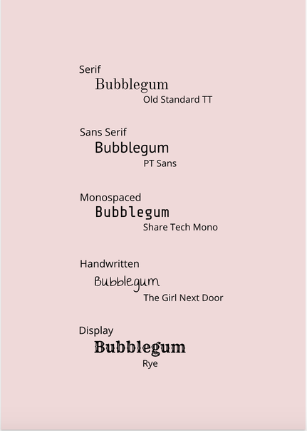 Word portraitsFor the word portraits, we were assigned to find 10 different fonts and think of two words for each font: one word that fit the style and one that did not. I think this assignment shows how big of a different the font makes when trying to get your message across. 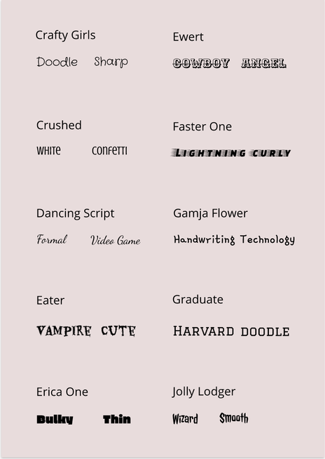 4/3/2021 0 Comments Pen Tool ExercisesIn this assignment, I learned how to use the pen tool on the Gravit. The pen tool is a feature on Gravit that allows you to make custom shapes easily. For this summative we were given three exercises. All three are shown below. The first two were basic exercises getting me used to using the pen tool and knowing how to make curves, straight lines, etc. I also learned how to manipulate the lines to become the perfect shape I needed it to be. For the last exercise, I used a picture of a milk carton and a cat to make a cat wearing a milk carton, and I used a minecraft background and put that behind the cat. I made this composite image because there is a joke that choccy milk (referring to chocolate milk) makes all the pain go away. With this in mind, I remembered seeing a bunch of cats that seemed to be crying so I thought it would be fitting to have a sad cat wearing a chocolate milk carton. In the beginning it was quite difficult using the pen tool to make certain shapes, but as I got used to it and learned different tricks to make the process easier, it became very easy and simple to do.
  3/7/2021 0 Comments Shape Scene SummativeHere it is! After a few lessons that taught me the basics of Gravit, we were assigned a summative assignment. In this assignment, we were supposed to create an illustration in Gravit that had a personal connection to us. Below, you can see my illustration. It shows a crescent moon, a full moon, as well as the sun. The sun is seen setting and diving under the sand and horizon. There are also light pink clouds that seem to flow in a diagonal direction. Along with that, there are two sets of stairs in the foreground. How is this personally relevant and how is it connected to me? This illustration I created is a more refined and simple version of one of my most recent paintings. Painting is one of my favorite hobbies and this painting just really helped me figure out my style. I enjoy painting in more of an abstract style which is why it is very different from just a normal scenery. Though it contains parts that you might find in a normal scenery painting, there are also other parts added in the painting to add an original, some might say chaotic, sense. 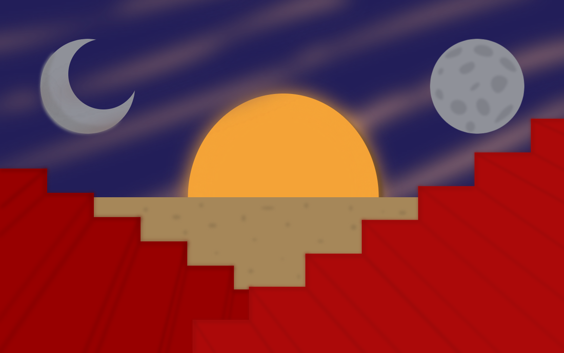 2/17/2021 0 Comments Shapes in GravitToday's lesson taught me a bit about how to manipulate and distort shapes on Gravit. For example, I can round the corners of a rectangle and control how rounded it is. This assignment was very straightforward and simple but also very important like the other assignments I did in Gravit. I also learned how to merge shapes, and use the union, subtract, intersect, and difference tools. 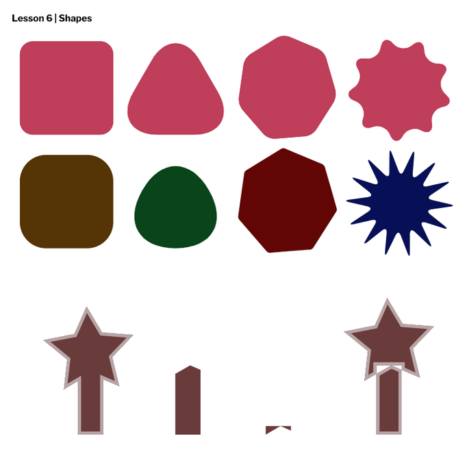 In this lesson, I learned how to control layers, how to make groups, and how to neatly align shapes in Gravit. This lesson taught me new new keyboard shortcuts and was quite simple but important. For example, command + D will group your selected shapes into one group to make it easier for you to organize all your shapes. Overall, this lesson was very important for the future when I have to apply all that I have learned into some type of final assignment. 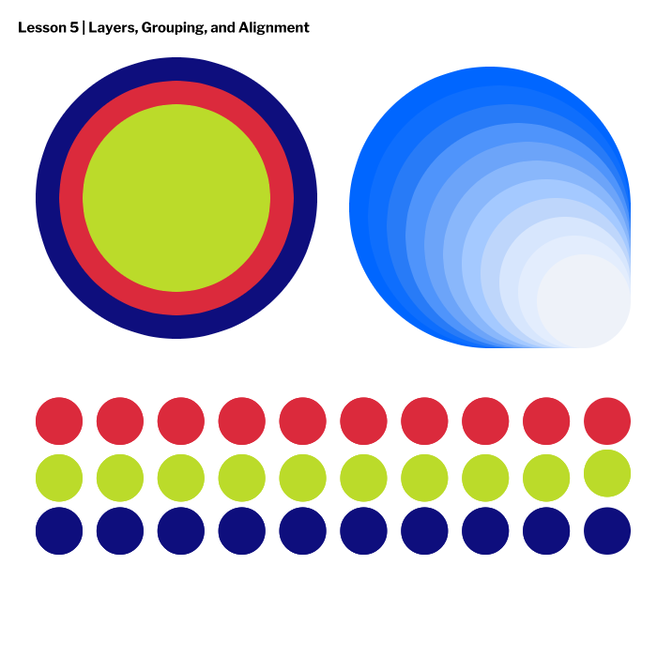 2/4/2021 0 Comments fill and borders in gravitIn today's lesson, I learned about how to change up a shape's fill and border in Gravit. As you can see in the photo below, you can remove the border and the fill from a shape, change where the border is aligned, change how the corners look, create dashed lines, and change your shape's opacity. Changing a shape's opacity means you make it more see through or more opaque. 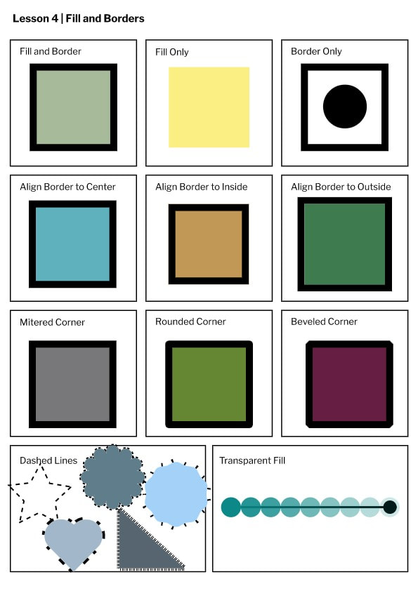 2/2/2021 0 Comments Selection tools in gravitIn today's lesson I learned how to create basic shapes in Gravit. I also learned how to manipulate these shapes with the subselect tool. I also learned some new keyboard shortcuts to make creating these shapes easier. For example, the pointer tool is V, the subselect tool is D, the line tool is L, rectangle tool is R, and the ellipse tool is E. 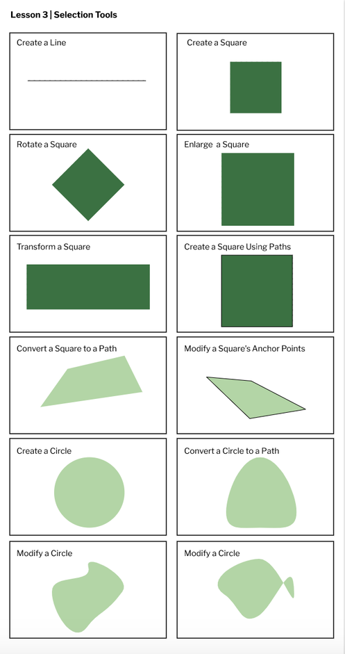 1/25/2021 0 Comments Pages In GravitIn today's lesson, I learned how to use Gravit's basic functions. My first project in Gravit consisted of me creating four pages, all different sizes. Below you will see that I made a custom page, and A4 page, an A3 landscape one, and finally a blog cover page. I first thought using Gravit would be quite difficult, but it is very easy to create new pages, customize the sizes of them, change the color, etc. 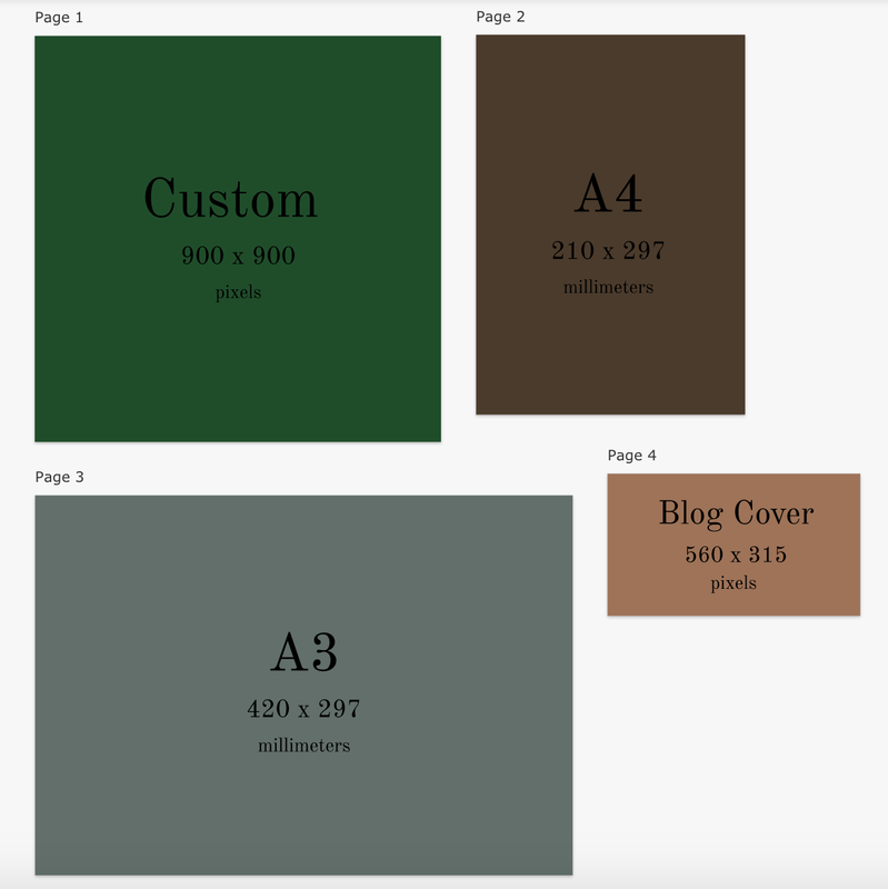 |
Archives
November 2020
CategoriesAll Creative Commons Graphic Design Images Web Design  This work is licensed under a Creative Commons Attribution-NonCommercial-NoDerivatives 4.0 International License. |
 RSS Feed
