|
5/27/2021 0 Comments Logo DesignFor this summative that draws the year to an end, we were assigned to use all our knowledge about Gravit and how it works to make a logo without using any images to trace over, reference, etc. The creating process was quite easy, surprisingly. I just created three circles, the actual vinyl, the colored part and label, and lastly the holy in the middle of the vinyl. I then used the text feature and pen tool to further detail the label. As we were told to make three different variations of our logo, I decided to act as though all three were on a wall and made the vinyls all cool tones to go well with each other. The most difficult part about making this logo was the text and making it perfectly wrap around the record, even now it is still not perfectly aligned, but I tried my best. To help me with this challenge, I created circles and lines to make sure my text was evenly wrapped and lined up with each other. 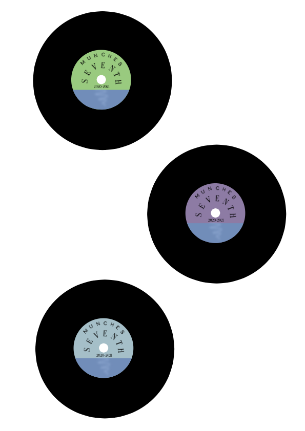 I decided to create a logo for myself. More specifically, I wanted to make an album for all the songs I listened to this year. I wanted this to have the same retro feel as old cassette tapes where when you play it, it instantly brings memories of better times from the past. I wanted to create a vinyl record because of several reasons. The most important one being that I love music. It has played such a huge role in my life so far and affects me heavily. My dad was also quite a collector of vinyls, all of which I believe we still have. I also just really love the way vinyls look and the feeling they give off. Out of all three of the variations for my logo, I liked the first matcha colored vinyl the most. Recently, the sage/matcha green has been a favorite color of mine for it's just so calming which is why I prefer that vinyl over the rest. 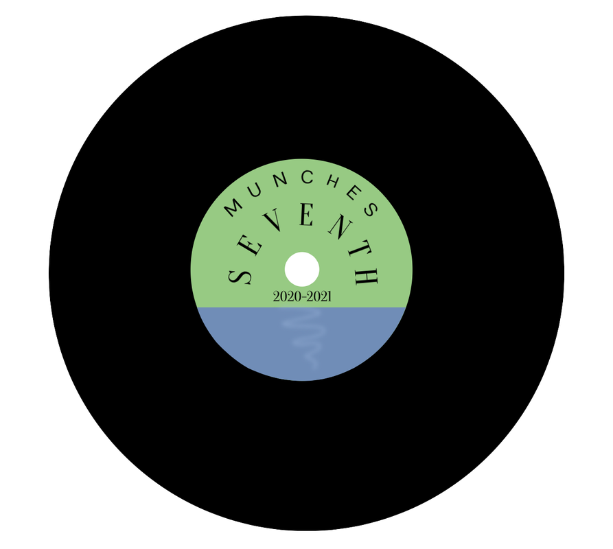
0 Comments
Leave a Reply. |
Archives
November 2020
CategoriesAll Creative Commons Graphic Design Images Web Design  This work is licensed under a Creative Commons Attribution-NonCommercial-NoDerivatives 4.0 International License. |
 RSS Feed
